Showing posts with label art history. Show all posts

Thursday, November 17, 2016

#206 More Lithography Stuff

Sorry again for a long absence!

I never ended up posting my final prints from the Lithography class, 
the culmination of the Seven Wonders project. 

Here they are; not the best photographs. I had hoped to take better ones 
but never got the chance, so this is what you get:

Pretty happy with these.  Background is a little bland on both, and in retrospect 
I should have taken the time to add some clouds or something. Alas...

I definitely feel like this is the stronger of the two. Again, background would
be improved with some addition of clouds, or maybe a sun or moon.
I am very happy, though, with the tiny dolphin at the center of the print! Adorbs!

And another picture of the Vegetable Flight into Egypt Landscape.

Wednesday, August 20, 2014

#199 Seven Wonders Sketches Part Two

No Animalia Post today. Sorreeee. But here's this instead.

For the Seven Wonders Series:
A sketch of the Hanging Gardens of Babylon, in large
part inspired by what I remember of Nick's early sketches,
one of which can be seen in my last Seven Wonders post.
I'm very happy with this one, and for the battle, it'll be drawn
very large, with smaller Zeus and Artemis monsters fighting it.

Tuesday, August 19, 2014

#198 The Rhinoceros

Animalia: Day 141
The Rhinoceros
After Albrecht Dürer

After Albrecht Dürer + TMNT

Dunno.

Explanation: So I approached this drawing thinking about Dürer's ever-present rhinoceros. Dürer's rhino is a landmark in the history of art and – more importantly for me – in the history of printmaking. Perhaps more broadly, it is a landmark in the history of science and knowledge. It accordingly serves as the cover illustration of Susan Dackerman's exhibition catalogue Prints and the Pursuit of Knowledge. I take this print as a teaching point every time I talk about the history of prints and the power of images, especially in terms of multiples. 

(Dürer's Rhinoceros, via wikipedia)

It remains the quintessential image of a rhinoceros. Despite its inaccuracies, this image was powerful enough to shape the very idea of 'rhinocerosness' for hundreds of years after its production. One can read the wikipedia article (yes, it has its own article) for the whole story, but suffice it to say that this image – apart from looking super cool – changed the history of art, science, and knowledge itself.
And it is still effecting images of rhinos, and artists interested in interpreting Dürer's work in countless ways:

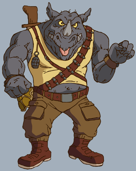
So I thus knew that I too would pay homage to Dürer. I first considered showing a more realistic rhinoceros removing the armor plates that Dürer has applied, as if he were wearing a suit of armor. This website is pretty exciting in showing the armor in its constituent parts. I then was thinking about more anthropomorphic rhinoceroses, and remembered Rocksteady, the constant companion of Bepop, from the Teenage Mutant Ninja Turtles. I remember him from the cartoon, but it occurs to me that I might have had his action figure as well. I can't remember for sure.

Rocksteady (via TMNTpedia)

So I sketched out the body first on paper, then traced it onto the wacom tablet, giving me a basic outline. Since it was a sketch, at this point I hadn't added any of the clothes, but he was posed holding the gun. Then I started adding skin textures. Eventually, I had added textures to the whole thing, but hadn't added the clothes yet. This was more or less the third image posted above. At that point, I knew I wanted to post a version with all the textures visible, but the gun felt too violent, especially given what happens to rhinos in the wild, and other issues with guns happening right now in America. So I added the "Bang" to neutralize that. But it wasn't enough. I forgot about it and moved on to adding the clothes, which went well. I didn't go as far as giving him cargo pants and combat boots, but I still think it reads as Rocksteady without those, especially with the dangling turtle shell at his hips (what was that all about anyways?). Anyways, after having completed the full Rocksteady outfit, I decided to return and remove the gun (first image). It results in a somewhat awkward stance, but I am glad I did it. It is better than a rhino holding a gun for no reason. The monogram was added last, obviously inspired by / derived from Dürer's own. I also briefly considered adding a version of the Dürer rhino as a Judoon soldier from Doctor Who, but decided it would be too much work, and would cover up all the exciting textures anyways. So alas, no Judoon.

But here is a bonus Rhino from a few years ago, drawn from the Natural History Museum's brochure cover.

Tomorrow (probs not tho): the Saiga Antelope.

Sunday, August 3, 2014

#185 The Alchemist, Pages

Here are the first few pages of The Alchemist, the comic from the previous post. As you can see, the further along in the comic I illustrated, the more complex the drawing style got, to where the first page was about one night's work, the second page was maybe two days' work, and the third, unfinished page was already at about four days' work. And at that point I hadn't even reached the introduction of the protagonist. So the project seemed to be getting a little out of hand, in terms of how long it would have taken. Potentially it is something I can return to at any point, but we will see what happens. In any case, you can see the progression of style to be more realistically rendered, especially comparing the human figures. As mentioned in the previous post, the text and dialogue were written by a collaborator, Jonathan Martin.
Most of the panels on this page are unresolved, both in terms of composition and finish. I wasn't really sure how to integrate everything, especially in horizontal compositions when I wanted two characters interacting (in communion), which felt like it needed a more vertical slant.

Friday, August 1, 2014

#184 The Alchemist - Sketches

About two years ago, I started discussing the idea of making a comic 
book with a friend in the graduate program at SMU. He brought in an
English major friend from undergrad who already had some ideas
about a story, and together we worked more on basic outlines of plot.
It was going to be something like a supernatural comic about an 
alchemist in medieval Spain who hunts demons using alchemy - 
potions and gunpowder and some supernatural things. Knives too.
Like a medieval alchemist version of Guy Davis's The Marquis.
In any case, here are some character sketches.
The protagonist. 
Based his appearance on Medieval/ Renaissance images of alchemists, 
Jews, arabs, etc. (i.e. the 'other'). Thus, forked beard, pointy hat.

Demon sketches.
Based some on Medieval / Renaissance images of demons.
The one at the top left would be the main demons, and bear similarities
to the Angel I also sketched. The little guy with black wings, and the 
goofy wobbly leg guy to his left would have also been in it, I think.

This is the angel's design, based on medieval images and biblical
descriptions. The demon and angel were meant to look like they
were at one point the same race because the bible and stuff.


Thursday, July 31, 2014

#182 Seven Wonders Sketches Part One

Back around 2009, Nick Francel and I conceived of a series
of prints - probably silk screened, though we considered etchings -
of the Seven Wonders of the Ancient World coming to life and
duking it out in a giant monster battle of ancient and epic proportions.
Back then, we did some sketches and divided up the wonders,
but we never got to the actual making stuff together part.
When we met up again in 2011 in Boston, we did a few more 
sketches, and tweaked the ideas a little, but again, no further.

Unfortunately, the original sketches for most of the wonders were 
lost to time and - most likely - the back of a flat-file in St. Louis.
However, I do have one of Nick's sketches from our time in Boston:
(Here we were toying with the idea of making them worm's-eye-views.
But I am bad at foreshortening so we abandoned that.)

We divided up responsibilities, each doing one Wonder per battle:

Nick:                           Jun:
- Hanging Gardens   VS.   Pyramids -
- Temple of Artemis   VS.   Statue of Zeus -
- Colossus of Rhodes   VS.   Lighthouse of Alexandria -
- Collaborative Mausoleum of Halicarnassus Zombie Apocalypse -

In any case, I loved this idea, and think about it often.
With that in mind, I started working on all of them again last month.

And now I have sketches done for everything except for Zeus and Artemis.
I have also rearranged the battles, so that it is as follows: 
Mausoleum VS. Pyramids
Colossus VS. Lighthouse
Zeus + Artemis VS. Gardens

I am posting some of the sketches now here, but I plan on making them 
into etchings eventually. Unfortunately the Cité does not have etching 
facilities, otherwise I would be making the prints as we speak.

Here are some mock ups made with sketches:
This will also have both sides producing giant waves and boats.
The Colossus's boats will have Greek Fire and he might also be blowing fire 
from his torch. The Lighthouse will also have some arrows stuck in him.

I forgot that in my sketches back in 2009, I also had the Sphinx
helping the Pyramids. I will probably add that for the etching.
The Mausoleum was drawn on a much smaller scale, so in the final
there would be a lot more details of statues and such, and many 
more lions and zombie skeletons.


Friday, February 28, 2014

#169 First Engraving

Hey all! I made my first engraving!
 
I have wanted to do engraving for a while. It is one of the 
most basic intaglio processes and was ubiquitous in the early modern 
world, but is now one of the least practiced of those print processes.
It is also purty freakin hard, thus the lack of contemporary practice.
I chose to use zinc for my first engraving because it is softer 
and more forgiving than copper, and because it's my party etc.

The engraving is of a wild man by a pollard willow, and I took inspiration 
engravings of wild men (note my borrowed monogram form), Dürer's
subject, and Dürer and Schongauer's engravings of the Flight into Egypt.

I am overall very happy with the print, 
but the experience was not without problems.

Here is the plate. I ended up using the back of the zinc plate because I
messed up the front. The back has this industrial varnish on it, which I
planned to remove later, but it turns out it is pretty insoluble. Removing
the varnish might damage the plate, so I plan on editioning with said varnish
still on. You can also see  where the burin slipped on one of the clouds,
and I tried to burnish it and the varnish lifted a bit.

I was able to print it at Georgetown, with the help of Prof. Scip 
Barnhart, who was super nice, super knowledgeable (especially re: stone 
lithography), super generous, and an all around super guy.

Scip suggested we print the plate relief as well, which I would not 
have thought to do had he not suggested it. It prints surprisingly clear.
I am surprised I have not seen any early modern examples of 
printing intaglio plates in relief. Surely it must have been attempted?

Monday, September 23, 2013

#166 Silverpoint / Copperpoint

For a while now, I have been meaning to 
undertake some metalpoint drawings.
To this end I procured some copper wire from 
Home Depot, and some silver soldering wire from William Binnie.

Today, I visited the paper conservator at the National Gallery of Art
to talk about silverpoint, and she showed me a number of supports.
She then offered a few sheets of different prepared grounds to try out.
With these in hand, I then fashioned some electrical-taped tools
of which any prison-shank-aficionado would be proud.

The result:
Godzilla VS King Ghidorah (after Frans Post)

Here is Frans Post's original painting.
Vertical and Horizontal lines delineate different ground preparation.
The ground is bone ash and rabbit skin glue.
The right side of the page was dampened and rubbed with cheese cloth.
The middle horizontal third was burnished, and the
bottom third was sanded with pumice stone.
The dampening didn't seem to affect the surface too much,
but I found the burnished was easiest to work with.

The sky, background, and Godzilla are silverpoint.
The foreground and King Ghidorah are copperpoint.
When I was working, there was no visible difference in color
between the two, so I am interested to see how they age.

And here are the tools:

Saturday, June 15, 2013

#163 James Harper Tribute

So, when I first moved to Dallas
I went to an estate sale with my girlfriend.
The deceased was one James Harper, and he was a painter.
For $20, we bought a painting that was a copy of a Frederic Remington,
which is in the collection of the Amon Carter museum in Fort Worth.
We also bought his monogrammed wine glasses.

So this beauty – complete with its built in light attached 
to the frame – hung in our living room for two years. 
In the background, there are some mountains
that kind of look like weird white pyramids, and
for a while I wanted to add UFOs coming out of them.
In retrospect, there were a number of other paintings
I wish I had purchased.


Anyways, something finally got added:


Sunday, May 26, 2013

#162 More Doodles

More doodles from school.

Street urchin, Documentary Photography syllabus notes, cowboy hat, poses.


More moses and annunciation and stuff.
EDITE: I realized Nick alr'y did hands for eyes in this post.
Whoops. It cool tho. Steal from yo' frendz.

Tuesday, April 30, 2013

#161 Doodles

It's been a while.
Thesis is done, just finishing up papers.

Here are some doodles that I have done during class 
or in lectures over the course of the semester:

Left and Right: Class on Byzantine Icons / Lecture on Postcolonial Brazil

Class on Early Italian Ren

Lecture on arabic / latin vulgate bibles.

Lecture on WWII art restitution.
i might color the Bloch-Bauer at some point.

Byzantine Icons class.

Italian Ren Class. Torso Belvedere. 
Also, attempts at Animalia: the Possom. Might repost this as my Animalia entry.

Two lectures, one on German Lothar Baumgarten's kale landscapes;
another on Fred Harvey Girls. Look it up.

Byzantine Icons class.
Invented 17th century dress from memory.
St. George.

Hoping to return to Animals this summer.

Thursday, January 24, 2013

#160 Gutai Card Box


Hey all. I made a print!

It is for the upcoming Gutai Group retrospective at the Guggenheim.
My good friend Seth Caplan works there and asked me to participate
in a recreation of the Gutai Card Box (1962), in which:

     "visitors were invited to deposit a ten-yen coin, and a Gutai member inside selected and presented through a slot a premade postcard-size work by a Gutai member in return. Gutai Card Box, conceived as a comment on increasing automation in society, sought to democratize art."

What better way to democratize art than with the
democratic medium of the print.

Anyways here is the print:

シラガ 対 ヨシハラ
(Shiraga VS. Yoshihara)

In the print, Kazuo Shiraga takes on Jiro Yoshihara.
Both were founding members of the Gutai Group.
Shiraga is known for his piece Challenging Mud (1955),
in which he put on a sort of diaper and rolled around in mud.
Yoshihara is known for his paintings of circles, probably meant to be donuts (right?).

Gutai Group was founded in 1954, ostensibly by Yoshihara and maybe
Shozo Shimamoto, who made paintings by throwing cans of paint

1954 was also the year that Godzilla made his debut.
Godzilla was a giant monster produced by the nuclear
fallout from American bomb testing.

Ishiro Honda's classic featured the likes of Takashi Shimura,
one of Kurosawa's go to's, who had just starred in Ikiru a few year earlier.
Also, the score to Godzilla (by Akira Ifukube) is pretty amazing.
The theme is great by itself (the link is a medley, theme at start).
Also in the score, there is the strangely nationalistic
(for what nation?), almost Souza-esque Godzilla march.

1954 also saw the detonation of the American
thermonuclear hydrogen bomb test Castle-Bravo,
which – due to its unexpectedly large blast radius –
created nuclear fallout that resulted in the radiation poisoning
of a number of islanders and the Daigo Fukuryu Maru.

Here is an excerpt from the Gutai Manifesto:

          "Yet what is interesting in this respect is the novel beauty to be found in works of art and architecture of the past which have changed their appearance due to the damage of time or destruction by disasters in the course of the centuries. This is described as the beauty of decay, but is it not perhaps that beauty which material assumes when it is freed from artificial make-up and reveals its original characteristics? The fact that the ruins receive us warmly and kindly after all, and that they attract us with their cracks and flaking surfaces, could this not really be a sign of the material taking revenge, having recaptured its original life?"

To make culturally specific a misquote of Adorno:
How does a nation make art after Hiroshima?

Lots of Gutai work deals with ideas of negation, emptiness,
embodiment, violence, movement, the gesture, destruction,
and post-war (atomic age) apprehension.
Other non-Gutai Japanese artists were doing similar things.
Shomei Tomatsu was photographing objects from Hiroshima.
See also the ceramics of Kazuo Yagi:
Circle (1967) and Hekitai (Wall) (1963)
The texture of the ruptured ceramics reflect the effects of an atom bomb,
releasing the organic state of things. Glass bottles melt to amorphous blobs.
Compare it with the skin of Godzilla.

I am also reminded of the way Godzilla's trademark roar was created:

"The roar was present in the first Godzilla (1954) and was created by composer Akira Ifukube who produced the sound by rubbing a resin-covered leather glove along the loosened strings of a double bass and then slowing down the playback."

There is something very Gutai about the image of 
Ifukube rubbing a resin glove on a loose double bass.

But back to Shiraga and Yoshihara.
Yoshihara's circle paintings encompass much of the
 ideas of negation and emptiness after the war.
In Yoshihara's Red Circle (1969), a reference to the Japanese flag –
and hence Japanese Nationalism – is explicit.
How does one be nationalistic in post-war Japan?
A hollow red circle.
And Shiraga flails in the mud.

Saturday, September 3, 2011

#123 Meadows Museum Sketches

This is not an animal post.
School is mad hectic.
So instead of an animal,
you're getting sketches from the Meadows Museum at SMU.
Done during the class I am TAing.


On the left is Antonis Mor's portrait of the 16 year old Alessandro Farnese,
and from top to bottom is Maino, Adoration of the Shepherds;
Murillo, Jacob Laying Peeled Rods Before the Flocks of Laban;
Zurbaran, The Mystic Marriage of St. Catherine of Siena;
and a putto from a Murillo Immaculate Conception.
They're all Baroque, except the Mor.

Wednesday, January 19, 2011

#10 Sketchbook

Swoop.
Post number ten!
Here's more sketchbook stuff from the past two weeks,
and one from the Summer.

Inspired by and made on a placemat in Japan. Kanidouraku.


Alien Baltan and Ultraman,
poses and background inspired by Mike Mignola.


Bosch copy and the view from
Dunkin Donuts at Goverment Center.


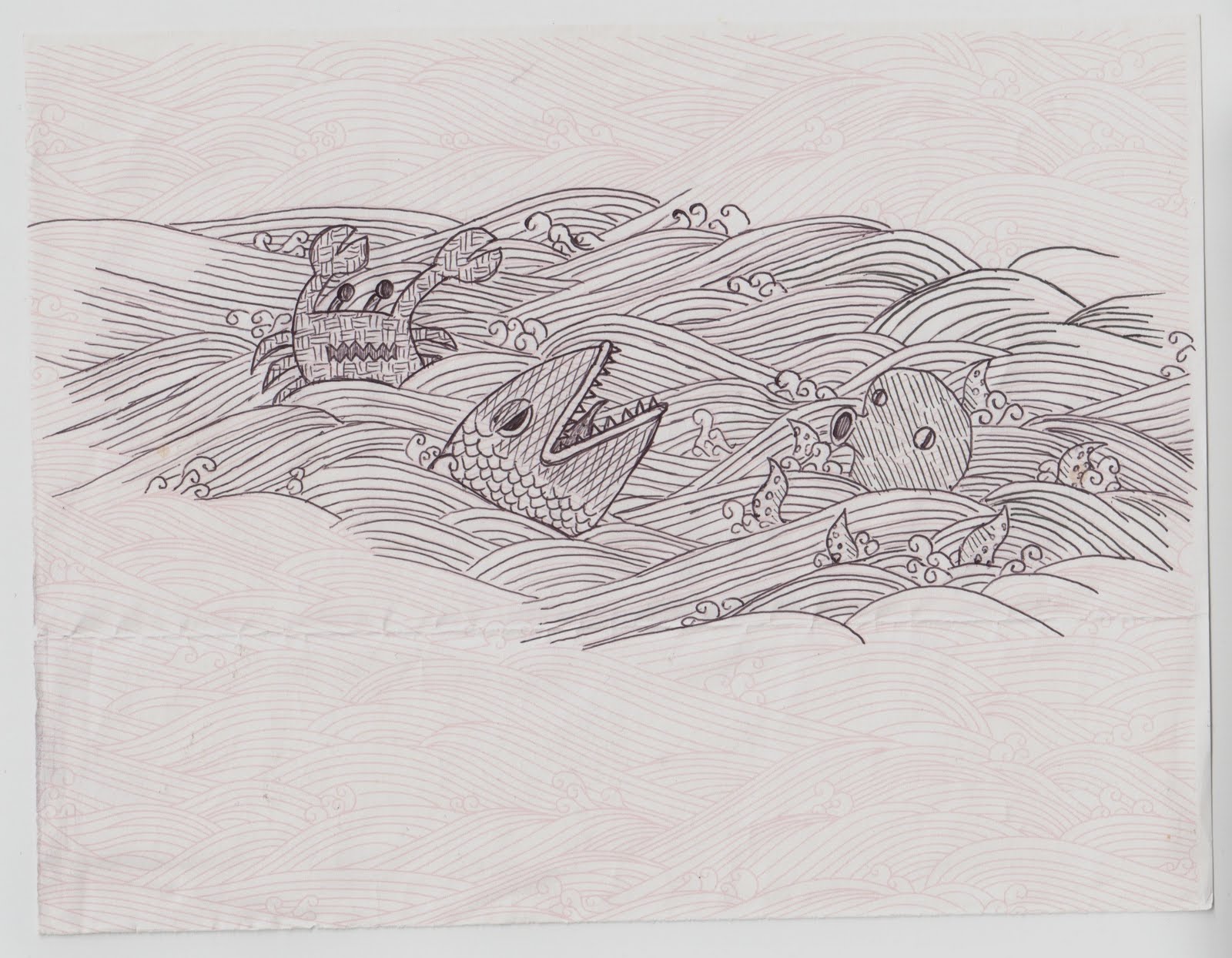
Rhino, from Natty H cover.
And a virus.


Drawn on the plane to KC.
The turtle started out as a the jacket
of the woman to my left, but she moved.